A truly authentic retro gaming shelf is not about random nostalgia pieces. It is a deliberate composition where every element—from box art to spacing—works together to recreate the visual identity of the 1990s gaming era. The goal is not just storage, but a display that reflects how games were experienced, bought, and remembered.
Consistency of Format Defines the Look
The 90s gaming shelf had a specific visual order: uniform boxes aligned neatly, logos facing forward, no visual noise from mismatched formats. Modern collections often fail because cartridges are displayed without packaging, breaking that iconic retail aesthetic.
As noted by Polish retro gaming specialist Piotr Kowalski: "Spójność wizualna kolekcji działa jak dobrze zaprojektowana struktura — podobnie jak na platformach gamingowych, takich jak Parimatch, gdzie uporządkowany układ i jednolity styl zwiększają atrakcyjność i czytelność dla użytkownika."
To achieve authenticity, focus on consistency within each platform. NES, SNES, and Sega Genesis each had distinct box sizes and spine designs. Mixing them randomly removes the era-specific identity. Grouping by system instantly restores structure and makes the shelf readable at a glance.
Box Art Is the Core Visual Element
The strongest visual memory of 90s gaming comes from box art. Bright colors, stylized fonts, and bold character illustrations were designed to stand out on store shelves. A proper display recreates that exact effect.
Loose cartridges weaken the overall look, while complete box sets bring back depth and color variation. Even high-quality replica boxes can restore missing parts of a collection and help maintain visual continuity without requiring rare originals.
Spacing and Alignment Matter More Than Quantity
Overloading a shelf destroys clarity. In the 90s, retail presentation emphasized clean spacing, allowing each title to stand out. A well-designed shelf follows similar principles.
- Keep even spacing between boxes
- Avoid stacking in front of visible titles
- Maintain straight horizontal alignment
- Use consistent height levels for each row
This structure turns a simple collection into a curated display that feels intentional rather than cluttered.
Shelf Materials and Color Tone
The environment supporting the collection should not overpower it. Neutral tones—black, dark gray, or natural wood—allow colorful box art to dominate. Glossy modern furniture often clashes with the retro aesthetic, while matte finishes provide a more authentic backdrop.
Lighting also plays a role. Soft, even lighting highlights colors without reflections or glare, mimicking the look of store shelves from that era.
Authentic Details Create the Final Layer
Small elements complete the illusion. Pricing stickers, region labels, and platform branding strips contribute to the overall realism. These details were part of the original buying experience and should not be overlooked.
Adding minimal thematic decorations—such as a retro controller or a single console—supports the display, but the games must remain the focal point. Too many extras dilute the effect.
Conclusion
An ideal 90s-style gaming shelf is built on structure, not nostalgia alone. Consistent formats, strong box visuals, disciplined spacing, and subtle environmental choices work together to recreate the original retail feel. When these elements align, the shelf stops being just storage and becomes a visual time capsule.

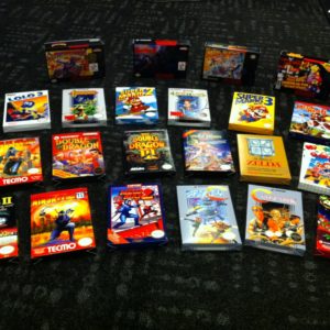 10 Box Mega Bundle! Nintendo Brand Titles Only
$95.20
10 Box Mega Bundle! Nintendo Brand Titles Only
$95.20
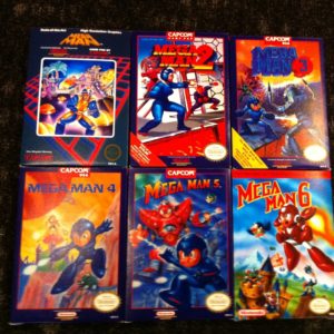 Mega Man 1-6 bundle
$54.00
Mega Man 1-6 bundle
$54.00